By Jean-Yves Bernot, French meteorologist, specializing in racing.
Several weather forecast documents are available. They are coming from different sources: numerical files in Grib format, weather charts in various images formats (jpg, png, etc.), satellite images, etc. The ideal is to be able to superimpose them in order to compare the different weather data with one another as well as with Adrena routings. To do so, the georeferenced images overlay function available in Adrena Version 13 can be used.
Weather charts and Grib files overlay
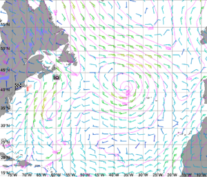
It is not always easy to make a correct analysis of a weather forecast situation by reading a Grib file. In the following example, the low pressure situation off the American coasts does not seem clear.
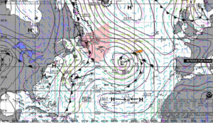
In the following one, it makes more sense!
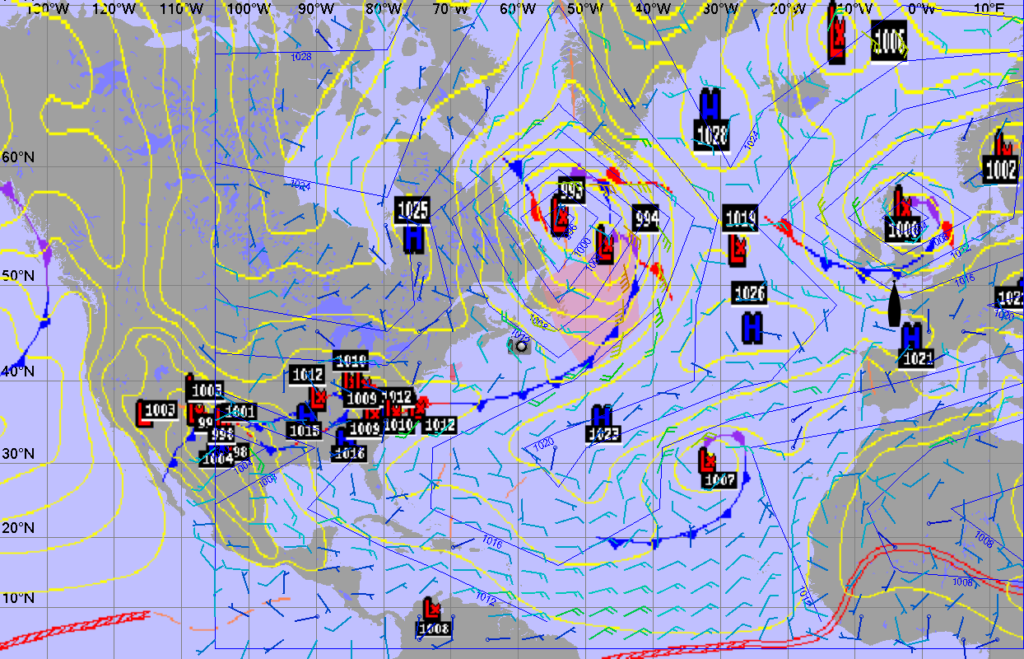
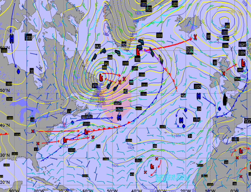
We superimposed the NOAA analysis chart on the GFS Grib file.
Method 1: use a Roadbook
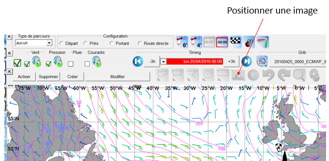
To carry out the operation, we used the Roadbook function: insert an image.
The selected chart can be properly positioned by adjusting the edges of the image – right click, move the point. The chart will be saved in the mm directory (Multimedia) of Adrena.
Once it is saved, just replace the old chart with the new one which will be directly positioned when the Roadbook is activated.
Note 1: it is better to superimpose data coming from the same sources – GFS model and weather charts from the NOAA for example.
Note 2: this operation is only possible if the weather chart is available in Mercator projection which is the case for NOAA charts.
NOAA websites:
- North Atlantic (north 20 N)
- South west tropical Atlantic
- North Pacific (north 20 N)
- North east tropical Pacific
This method works for any weather chart displayed in Mercator projection, no matter what the source is.
Method 2: use of georeferenced charts
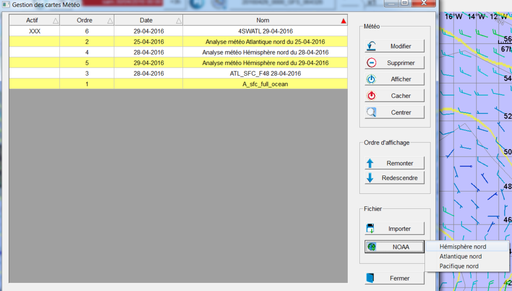
If the weather document is in kml format, Adrena Version 13 is doing half the work for you: some NOAA charts can be displayed in one click. Use Charts menu/Weather forecast charts/NOAA
3 charts available:
- Northern hemisphere: NOAA analysis of North Atlantic and North Pacific
- North Atlantic: 48h forecast in North Atlantic
- North Pacific: 48h forecast in North Pacific
Click on the chart then on ‘Display’ (or ‘hide’ to take it off…).
In this example, you will notice that the “SHOM coastline” chart is displayed and sea color is blue – Display/chart display options – in order to highlight documents in which colors are optimized for Google Earth.
Other NOAA documents in kml format are available on this website. All you have to do is to download and open them with Adrena: Charts/Georeferenced images or Charts/Weather overlays/Import. Here is a 24h forecast NOAA chart overlaid on a GFS file.
Satellite images and Grib files overlay
Satellite images give the possibility to see beyond the skyline and to deliver precise details on the weather forecast. The overlay of satellite images and Grib files can give visual information that are particularly useful for shifts in trend or local effects.
Observation in real time
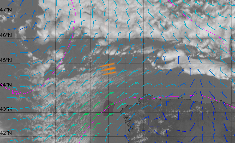
Changes in wind force and direction are often associated with visible clouds on satellite images. In this example, south of the boat, we can notice the apparition of a tray of altocumulus that seems to be linked to the increase of the north east wind force when we are out of the anticyclone area.
A simple method to make this superimposition is to get the satellite images with Squid software and to import them into Adrena. The procedure:
- Get the satellite image in Squid.
- In Adrena menu Charts/Satellite images then Import. Then open a .sat file located in “satellite” directory in Squid. The satellite image is displayed in Adrena.
- Then set up the Grib file to the required date in order to benefit from Adrena functions: positioning, distance measurement, boat track overlay and so on.
Study of local effects
In order to quantify local effects, we need to overlay satellite images and high resolution Grib files.
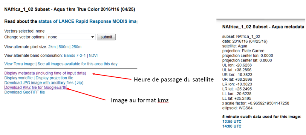
Modis satellite supplies high resolution satellite photos in image format as well as in kmz format which is the one that we need.
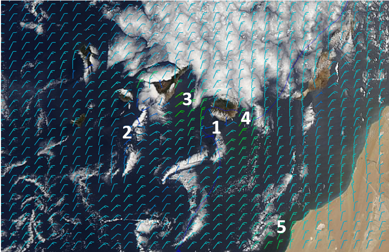
For example: windless zone in Canary Islands. Modis Photo and 0.1° Arpege Grib overlaid in Adrena. It looks nice…
- Windless zone in Gran Canaria. It is measured with Adrena: 34 M. The end of the windless zone is indicated by a convergence cloud where two different flows meet each other.
- Tenerife windless zone. It is measured: 75 M. the end of the windless zone is indicated by a convergence cloud.
- Wind force increase between Gran Canaria and Tenerife: 12 to 15 kt upstream winds are increasing to 23 kt in the way. Clouds disappear when the flow speeds up.
- Wind force increase in the east of Gran Canaria: 12 to 15 kt upstream winds are increasing to 20 kt in the east of the island. Clouds disappear when the flow speeds up. Note that winds quickly decrease on the limit of windless zone.
- We can notice a wind force increase along the Africa coast because of daytime temperature decrease. It is necessary to be at less than 20 miles off the coast to benefit from it. The area that is windier is also indicated by an area without any clouds close to the coast.
Note: A layer of altocumulus and stratocumulus bumping into landscape indicates that there is an inversion preventing the flow from going above the mountains. Windless zones are strengthening and whirling. The real situation may be harder than what is shown by the model…
Procedure:
- On Modis website, load the satellite image in kmz format as well as metadata that indicate at what time the image was taken.
- In Adrena, Charts/georeferenced images. Open the satellite image. It is displayed in Adrena by being overlaid on the charts, on the Grib files, and so on. Are you ready?
Miscellaneous
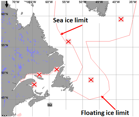
If you are sailing in Northwest Atlantic, you will be interested by the icebergs limit provided by US coastguards and the Canadian Ice Service. The chart and a kml file – at the bottom of the page – are available here. It will be displayed in Adrena: Charts/georeferenced images.
For sure, you will find plenty of other applications to these magical functions.
